

Thursday, 27 October 2011
How to... undo things
For this editorial I was looking at things that can't be undone, so I decided to experiment with shoelaces tied up in an impossible knot. For the shoes I referenced brogues (they're great fun to draw!) and am currently trying to find a way of depicting the laces. It was suggested that I incorporate arrows into the image, demonstrating how to untie the laces (like in a how to guide/ old fashioned manual?) which is something I'm trying to resolve at the moment.

This is my rough so far, although it's hard to work out what's happening with the laces and arrows as everything's all the same sort of tone. Media wise, I was contemplating lino cutting the shoes and adding everything else on digitally (drawn and scanned in) but I'm not decided yet. I was also hoping to keep the brogues themselves either black and white or one colour, with the laces as a contrasting colour to ensure that everything's easily readable. I'm not sure what to do with the arrows though at the moment...
Small Victories (again)
Here's another rough for the small victories editorial. After talking with the tutors I decided that jigsaw puzzle pieces were too cliched, so instead I've replaced them with bricks


How to... be conceited
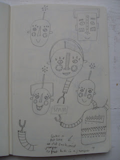
Here's my rough for the 'how to... be conceited' editorial. I really wanted to experiment with hand rendered typography in this piece and will probably create the outcome in a similar way to my SPAM piece- by scanning in sheets of painted paper and assembling them digitally.

Sketchbook pages...


Sketchbook pages...

Tuesday, 25 October 2011
Small Victories...
I did some work on the small victories editorial brief today. I'm still trying to reach a solution but it's gradually getting there... here's the latest attempt at a rough...

I've been trying to resolve the composition by experimenting more with angles (having the jigsaw puzzle diagonal rather that following vertical and horizontal lines)

I've been trying to resolve the composition by experimenting more with angles (having the jigsaw puzzle diagonal rather that following vertical and horizontal lines)
Monday, 24 October 2011
More SPAM
Another version of my SPAM outcome. I felt the red key line around the text was too thin so in this version I've made it a bit thicker which I feel works better.


Saturday, 22 October 2011
Reworked editorial
I tried to have a go at another editorial rough today, the article being about how small victories are more important to achieve than larger ones.

With this piece I was looking at what a small victory was to me (completing a jigsaw puzzle). I hope the message is a bit clearer than in the previous two roughs. I was also wondering whether I should put something on the puzzle pieces? I've added some ticks to demonstrate that tasks have been accomplished but I'm not sure whether these add anything to the rough. If I do include the ticks, I was also unsure as to whether they should appear on every jigsaw piece (too busy?) or just a select few? Feedback would be much appreciated! I've been getting a bit stuck on this one.

With this piece I was looking at what a small victory was to me (completing a jigsaw puzzle). I hope the message is a bit clearer than in the previous two roughs. I was also wondering whether I should put something on the puzzle pieces? I've added some ticks to demonstrate that tasks have been accomplished but I'm not sure whether these add anything to the rough. If I do include the ticks, I was also unsure as to whether they should appear on every jigsaw piece (too busy?) or just a select few? Feedback would be much appreciated! I've been getting a bit stuck on this one.
Friday, 21 October 2011

Thursday, 20 October 2011
Go forward with SPAM!
Finally finished my final outcome for the SPAM project after hours fiddling around on photoshop. I'm really happy with the characters and the scene in the middle of the piece, but something doesn't seem quite right with the text to me- it's a bit unclear. Maybe it needs another tone in/behind it? Let me know what you think.


Editorial roughs
Here are a couple of roughs I've just made for the editorial brief. I struggled at first getting some ideas down but I'm relatively happy with these as a starting point. I might try and get a few more roughs done before the deadline...


Wednesday, 19 October 2011
Marcus Walters
This is the link to the website and blog of Marcus Walters, an illustrator whose work I'm a huge fan of. He works predominantly with collage and screen print and experiments heavily with typography too. Have a peek at his work- you might recognise some of his advertising stuff...
http://www.marcuswalters.com/
http://marcuswalters.blogspot.com/


http://www.marcuswalters.com/
http://marcuswalters.blogspot.com/


Visual
Two roughs for my SPAM outcome, one showing the colours I'm intending to use. I have a habit of using quite bold, bright colours and wanted to try and tone them down a bit (especially the blue/grey and green) for this project, although I still wanted to keep them playful and fun. The red is perhaps still too saturated, but this is something I can manipulate and change in photoshop when assembling the characters.


SPAM ideas
These are just a few pages from my sketchbook showing the development of my SPAM advertisement so far. I've decided to print the space background with blue ink and lino and then digitally collage the characters on afterwards. I wanted to experiment with flat pattern in this piece which I think has worked especially well with the robot character.


Sunday, 9 October 2011
Party Time

Saturday, 8 October 2011
A work in progress...
I've been super busy the past week trying to decide on a composition for my party outcome. Initially I was trying too hard to create a scene, so instead decided to take a step back to try to produce more of a design. I also decided to rework my zookeeper character in less of a static pose.
Posts of my final outcome to follow... in the meantime, here's a couple of sketchbook pages.


Tuesday, 4 October 2011
A party for how many...?
These are a selection of characters I created over the summer, each influenced by the work of another illustrator or artist. For the majority of my characters, I tried to draw influence from my chosen practitioners by combining it with elements of my own work rather than completely replicating their style or aesthetic.

Influenced by Marcus Walters, this character was an experiment in cut paper collage. To achieve some of the colours, I prepared my own paper with acrylic paint.

For this character I looked at the work of illustrator Pat Hutchins. The outcome was an experiment with flat pattern and bold colour.

To create this Dada inspired character, I selected elements from old family photographs before combining them with something more mechanical (the microscope). This pays homage to the Dada fascination with man and machine.

Inspired by M. Sasek, one of my favourite illustrators. Again, this was an experiment in flat pattern within certain elements of the clothing.


Inspired by the work of illustrator Marion Deuchars. I wanted to create a piece that further explored the aesthetic and nature of reportage drawing; for the character to appear as though she had been observed rather than created.
Subscribe to:
Posts (Atom)