Wednesday 7 December 2011

Reworked small victories editorial

Just finished my modified outcome for the small victories editorial. I decided to replace the jigsaw pieces with objects representative of daily life but kept the colours scheme. Overall I feel this piece has been a success; much more so than the original outcome. 


In situe...


Tuesday 6 December 2011

Modified small victories

I've been trying to alter my small victories editorial piece before assessment next week. I want to move away from the jigsaw pieces and substitute them instead with objects representative of daily life including a car, mobile phone, pet dog etc. These objects will appear to have been slotted into place, taking reference from children's 3D puzzle games. Here's a rough compositional sketch...

Monday 5 December 2011

The Good Man

Here are some early character developments for my new brief based upon the short story 'The Good Man' by German born artist Kurt Schwitters. The story itself is about a good man who allows a mosquito to land on his hand and drink his blood. The mosquito flies away, full and content and returns to tell all the other mosquitoes all about the good man. Soon, the sky is black with swarms of mosquitos all heading towards him. They sting him and drink his blood but because there are so many non fly away satisfied. The story simply ends with the line "Meanwhile, the good man died".


I'm a bit unsure as to whether I want to create some sort of scene with my character or just a portrait (I'm gravitating towards the latter at the moment). I was thinking of creating a lino print background of a pattern of mosquitoes (perhaps having them red in colour to represent blood), creating my good man separately as a digital collage and adding him later. As usual I want to incorporate my use of flat pattern in the good man's face and in his clothes. I was also thinking about perhaps creating his hat so that it's made up of lots of tiny mosquitoes, rather than having them as a background. 


Here's my good man so far...

Sunday 27 November 2011

Sam in progress...

I've almost finished my double page spread for the Sam project. I just need to finish incorporating my text. Here's the pages so far...


Tuesday 22 November 2011

Work in progress

I've been working in photoshop trying to get the images for my Sam double page spread sorted, my line to illustrate being "Suddenly... Sam jumped out of bed". The first consists of a close up of my character Sam the chameleon's face, his expression surprised as if he's just been startled. The second shows Sam leaping out of a crocodiles mouth (where he'd made his bed for the night). I wanted to continue to experiment with pattern in this piece and so have been looking closely at the work of print maker Angie Lewin who creates wood cuts based around the natural environment, paying specific attention to plants and flowers. This is something I've tried to incorporate into my own piece; the second of the two pages will include my own pattern of leaves and jungle flowers. Here's what I've produced for the first page so far... I'm still not sure whether Sam looks surprised enough...


Suddenly... Sam jumped out of bed

A few sketchbook pages from the Sam project so far...


Tuesday 1 November 2011

Sketchbook work

Some development pages from my sketchbook for the editorial brief...


Small Victories...

I've been having real problems with this outcome but for now, have decided to stick with the jigsaw puzzle outcome. I've redrawn the though jigsaw (so it actually looks like a jigsaw) which is an improvement...

How to... undo things

I've reworked my initial idea for this editorial, now focussing on the idea of disassembly. This is my plan for my final outcome and I'm really pleased with it! I had a few problems decided how best to portray that the character is being dissembled rather than assembled. I'm still unsure whether the image alone resolves this, however, when placed in the context of the article hopefully it will become clear. 


Thursday 27 October 2011

How to... undo things

For this editorial I was looking at things that can't be undone, so I decided to experiment with shoelaces tied up in an impossible knot. For the shoes I referenced brogues (they're great fun to draw!) and am currently trying to find a way of depicting the laces. It was suggested that I incorporate arrows into the image, demonstrating how to untie the laces (like in a how to guide/ old fashioned manual?) which is something I'm trying to resolve at the moment. 


This is my rough so far, although it's hard to work out what's happening with the laces and arrows as everything's all the same sort of tone. Media wise, I was contemplating lino cutting the shoes and adding everything else on digitally (drawn and scanned in) but I'm not decided yet. I was also hoping to keep the brogues themselves either black and white or one colour, with the laces as a contrasting colour to ensure that everything's easily readable. I'm not sure what to do with the arrows though at the moment...

Small Victories (again)

Here's another rough for the small victories editorial. After talking with the tutors I decided that jigsaw puzzle pieces were too cliched, so instead I've replaced them with bricks


How to... be conceited

Here's my rough for the 'how to... be conceited' editorial. I really wanted to experiment with hand rendered typography in this piece and will probably create the outcome in a similar way to my SPAM piece- by scanning in sheets of painted paper and assembling them digitally.


Sketchbook pages...


Tuesday 25 October 2011

Small Victories...

I did some work on the small victories editorial brief today. I'm still trying to reach a solution but it's gradually getting there... here's the latest attempt at a rough...


I've been trying to resolve the composition by experimenting more with angles (having the jigsaw puzzle diagonal rather that following vertical and horizontal lines)

Monday 24 October 2011

More SPAM

Another version of my SPAM outcome. I felt the red key line around the text was too thin so in this version I've made it a bit thicker which I feel works better.


Saturday 22 October 2011

Reworked editorial

I tried to have a go at another editorial rough today, the article being about how small victories are more important to achieve than larger ones. 


With this piece I was looking at what a small victory was to me (completing a jigsaw puzzle). I hope the message is a bit clearer than in the previous two roughs. I was also wondering whether I should put something on the puzzle pieces? I've added some ticks to demonstrate that tasks have been accomplished but I'm not sure whether these add anything to the rough. If I do include the ticks, I was also unsure as to whether they should appear on every jigsaw piece (too busy?) or just a select few? Feedback would be much appreciated! I've been getting a bit stuck on this one.

Friday 21 October 2011

Modified SPAM

New and updated SPAM outcome with modified text. I think it looks much better.


Thursday 20 October 2011

Go forward with SPAM!

Finally finished my final outcome for the SPAM project after hours fiddling around on photoshop. I'm really happy with the characters and the scene in the middle of the piece, but something doesn't seem quite right with the text to me- it's a bit unclear. Maybe it needs another tone in/behind it? Let me know what you think.


Editorial roughs

Here are a couple of roughs I've just made for the editorial brief. I struggled at first getting some ideas down but I'm relatively happy with these as a starting point. I might try and get a few more roughs done before the deadline...


Wednesday 19 October 2011

Marcus Walters

This is the link to the website and blog of Marcus Walters, an illustrator whose work I'm a huge fan of. He works predominantly with collage and screen print and experiments heavily with typography too. Have a peek at his work- you might recognise some of his advertising stuff...

http://www.marcuswalters.com/

http://marcuswalters.blogspot.com/


Paper cut outs

Robot pieces!

Visual

Two roughs for my SPAM outcome, one showing the colours I'm intending to use. I have a habit of using quite bold, bright colours and wanted to try and tone them down a bit (especially the blue/grey and green) for this project, although I still wanted to keep them playful and fun. The red is perhaps still too saturated, but this is something I can manipulate and change in photoshop when assembling the characters.


SPAM ideas

These are just a few pages from my sketchbook showing the development of my SPAM advertisement so far. I've decided to print the space background with blue ink and lino and then digitally collage the characters on afterwards. I wanted to experiment with flat pattern in this piece which I think has worked especially well with the robot character.


Sunday 9 October 2011

Party Time


This is the final outcome for my character's party. I wanted my party to take place at a zoo, as my initial idea was predominantly based around the lion and zookeeper characters. In the end I decided to create a design rather than a specific scene, taking influence from old circus and zoo posters. I'm pretty pleased with the outcome, in particular the banner and bird characters.

Saturday 8 October 2011

A work in progress...

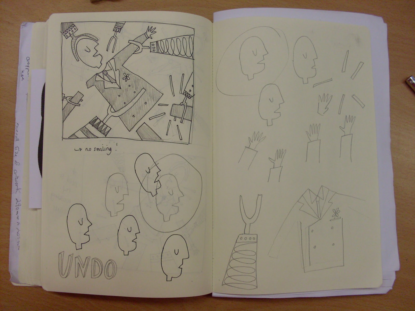
I've been super busy the past week trying to decide on a composition for my party outcome. Initially I was trying too hard to create a scene, so instead decided to take a step back to try to produce more of a design. I also decided to rework my zookeeper character in less of a static pose. 

Posts of my final outcome to follow... in the meantime, here's a couple of sketchbook pages.