

Thursday, 26 January 2012
Competition entry
I added some reflections onto the bottles to make it look as if the light was hitting them (it also makes it more apparent that they're glass). I decided against using the version with the extra bottles coming off the page- it makes the outcome look too much like a wallpaper.


Wednesday, 25 January 2012
Outcome?
Colour version of my medicine bottles. Any advice for possible improvement? Also, should I print it A4 or A3?


Where art meets science competition
Here's my entry for the East Midlands 'where art meets science' competition (currently a work in progress). I wanted to create a pattern based piece with no characters so have decided to base my outcome around the chronology of the medicine bottle. I created the outline of the piece with dipper pen and ink and am now adding blocks of flat colour behind the bottles digitally (unaligned). The last and most recent bottle in the series will contain some coloured pills rather than a single block of colour like the others. The initial plan was to create a screen print, however I ran out of time. I still might try a version using painted colour though.


Tuesday, 24 January 2012
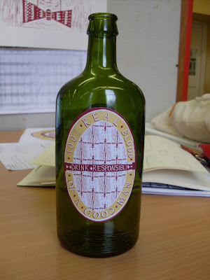
The Blood of a Good Man
Here's my finished bottle labels in position on my bottle! Need to now either fill and seal it or somehow stain the inside to make it look like the bottle is full of blood (or has been drunk).


I think I might need to change the back label so that it's just one or two of the mosquito prints rather than a whole pattern- I don't think it's that easy to read. Any thoughts?
Thursday, 19 January 2012


Tuesday, 17 January 2012


Monday, 16 January 2012
Lino cuts
I've been busy cutting my good man and mosquito lino ready to print for my Merz outcome. Lots of hours and many cuts later here are the end results...


Wednesday, 11 January 2012
Negotiated/Schwitters
Some development work for both my negotiated project and Scwitters submission. I've decided to design the labelling for a glass bottle which will contain the blood of 'The Good Man' (the character in my Merz fairytale whose blood is drained by a swarm of mosquitoes).


I started off by looking at old circus and freak show posters and was initially looking at having my own poster advertising The Good Man to the mosquitoes. This gradually developed into my current labelling design and idea. So far I've only worked on the front label, although I'm planning on creating a second for the back of the bottle which will feature details such as an ingredients list, number of units and maybe some drink aware information specifically aimed at the would be consumers of my product; in this case, the mosquitoes. I'm going to create a lino print of the character, hand draw the typography and the assemble all the different elements on photoshop.


Subscribe to:
Posts (Atom)